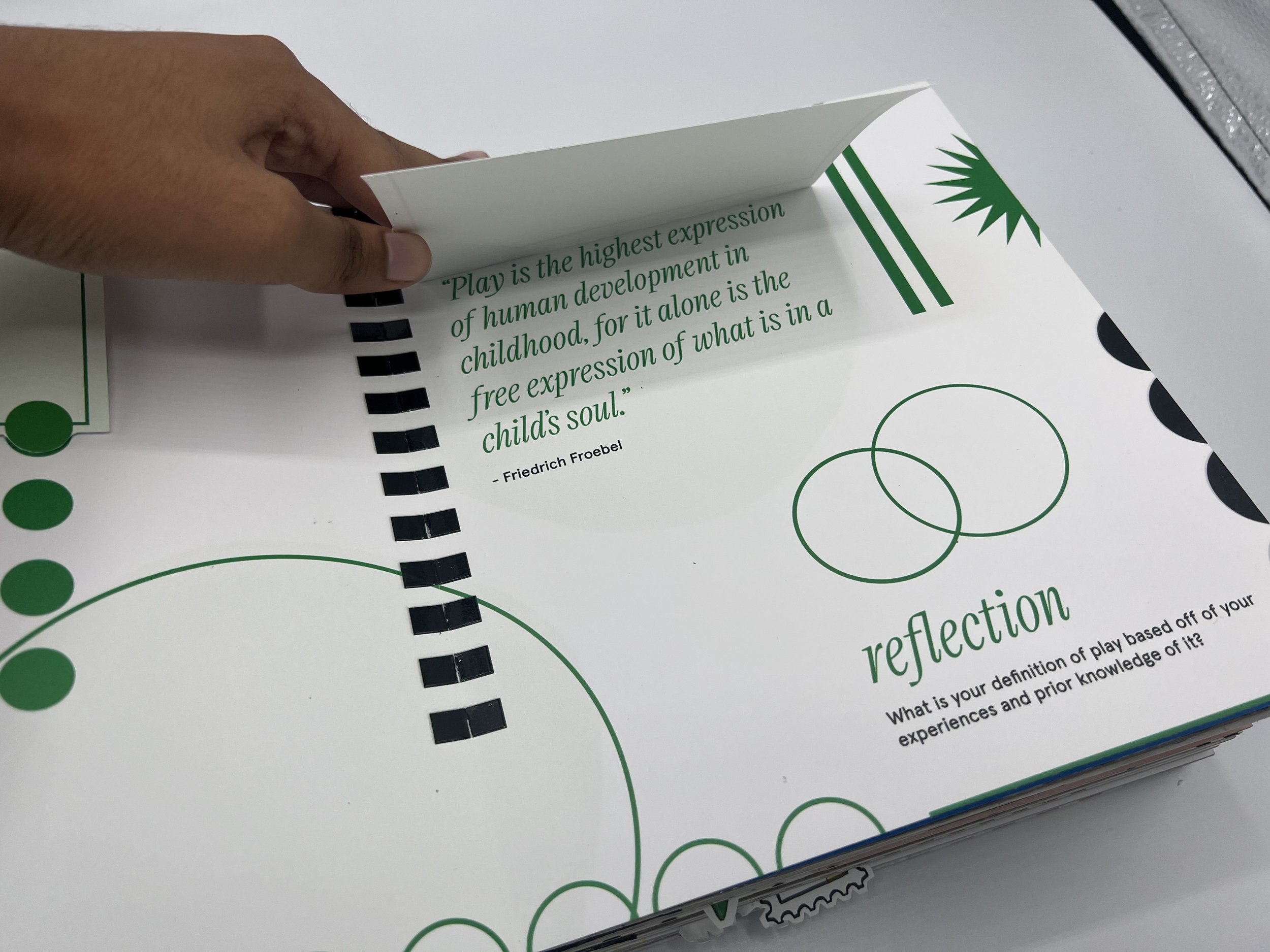
The PlayBook
The PlayBook is a tactile and interactive pop-up book for adults, which teaches them about play, its importance for adults, the benefits of play, play properties, play personalities, and more. The book aims to provide adults with an understanding of who they are through play, defining play for those who are unfamiliar with it, and encouraging adults to tap into their inner child.
I was inspired to create the book after visiting Design School Kolding in Denmark, which offers a master's program in Design for Play. I also have a love for children after 13 years of nannying and babysitting and noticed that play is a vital and necessary part of how children learn and experience the world, and that adults have much to learn from children's sense of play and wonder.


I wanted to speak to adults, including college students and those in the workplace, because I believe that we don't utilize play in the ways we should or could. As I did more research, I found that we as adults seem to struggle to find a balance between work, life, and fun. We also tend to lose our sense of play as we age and become more aware of the world around us. While it is necessary to mature and become implemented in the real world, it is also important to incorporate play into our lives to hone in and explore our creative sides. Having that proper balance and incorporating play into our lives can help us in many ways. Play has a plethora of benefits.
I researched the benefits of play in our adults lives and found that it can boost our well-being, help us to cope with stress, and improve our physical health as well. I also looked into the types of play, stages of play, and flow states. Flow states are a huge part of what makes play, play. The seven properties of play are purposelessness, voluntary nature, inherent attraction, freedom from time, diminished self-consciousness, improvisational potential, and continuation of desires, as defined by Dr. Stuart Brown.

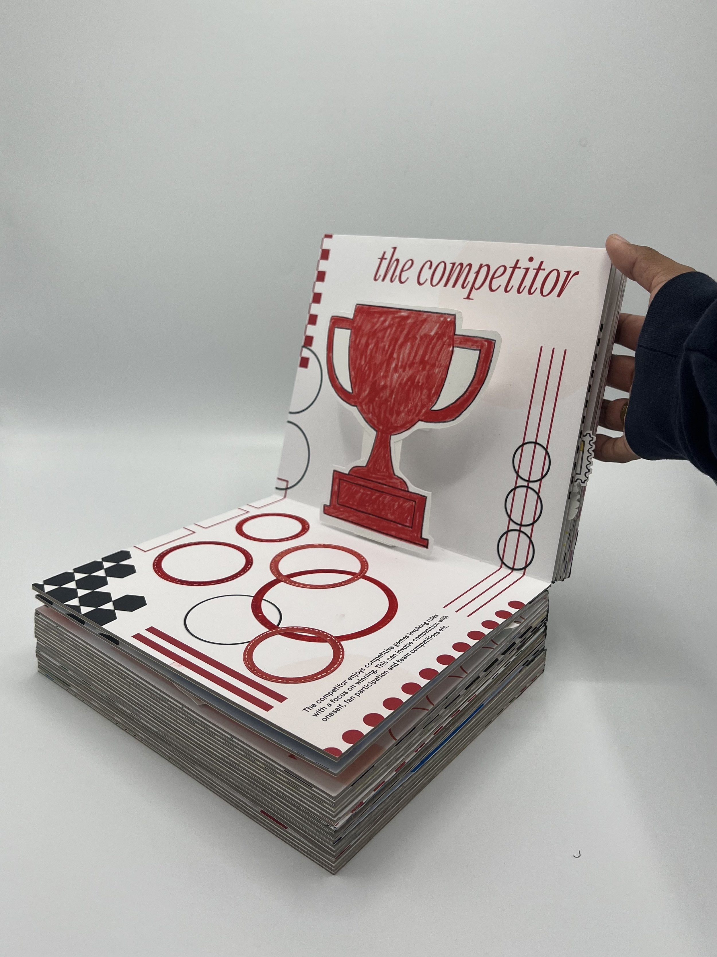
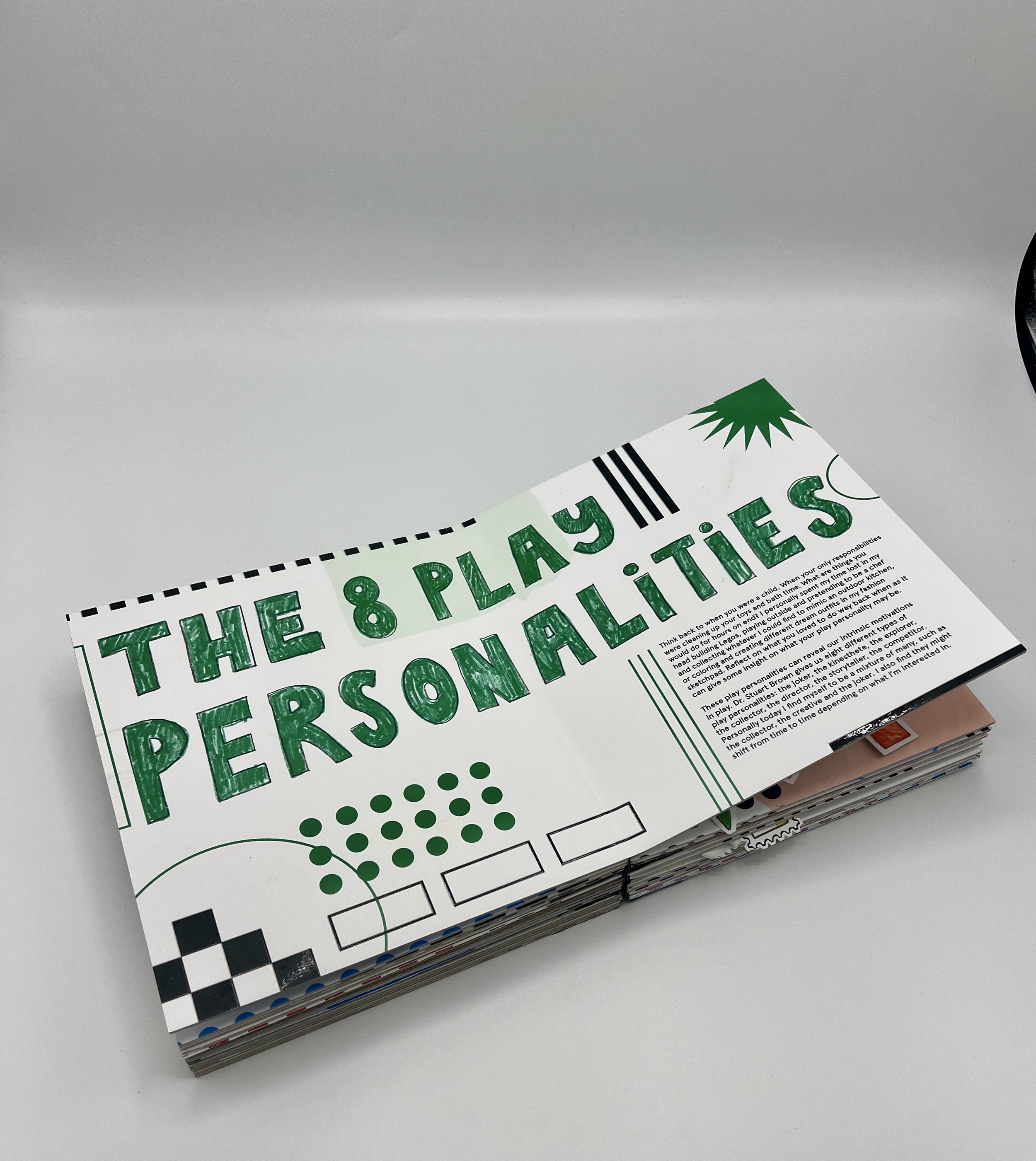
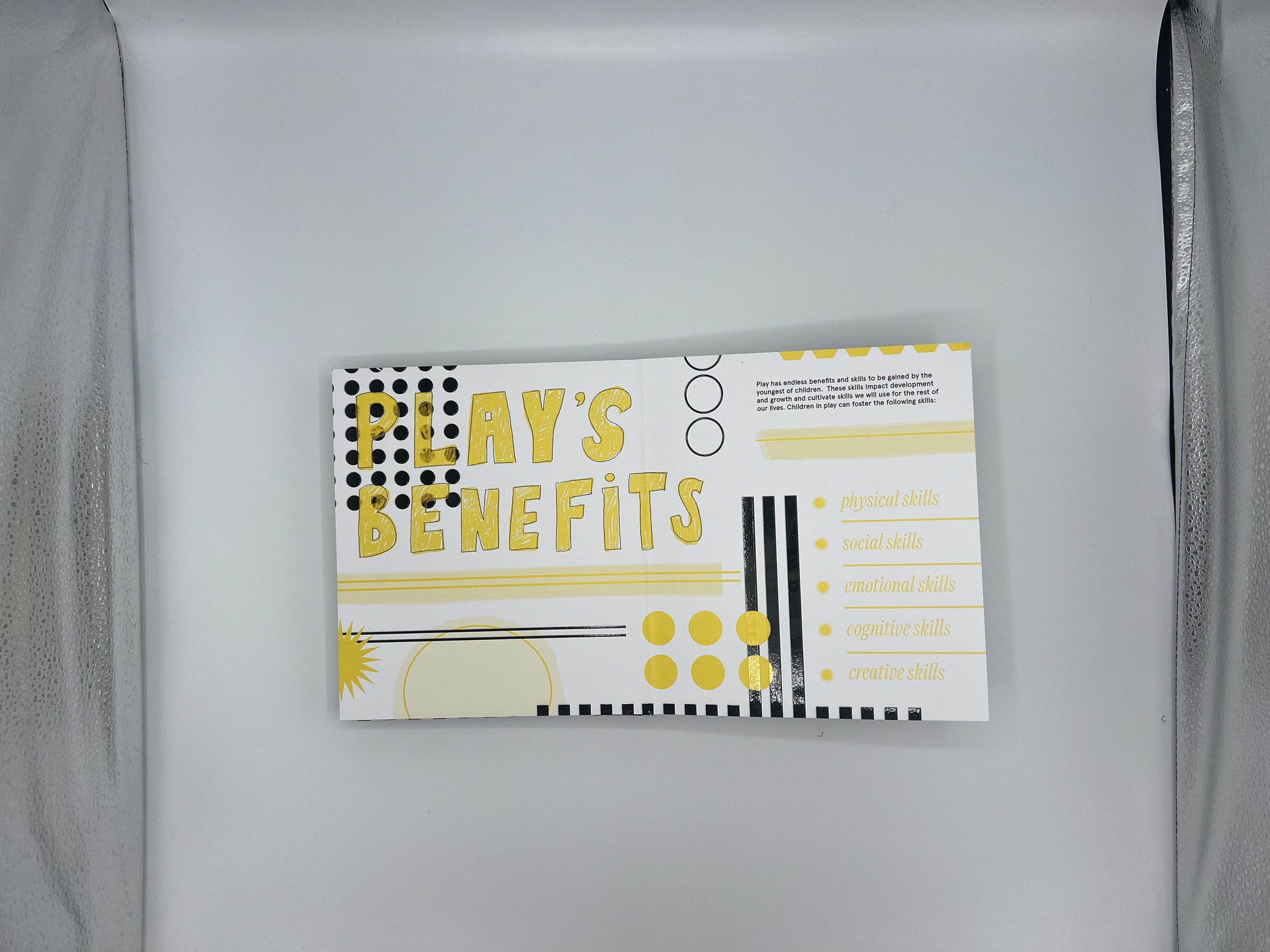
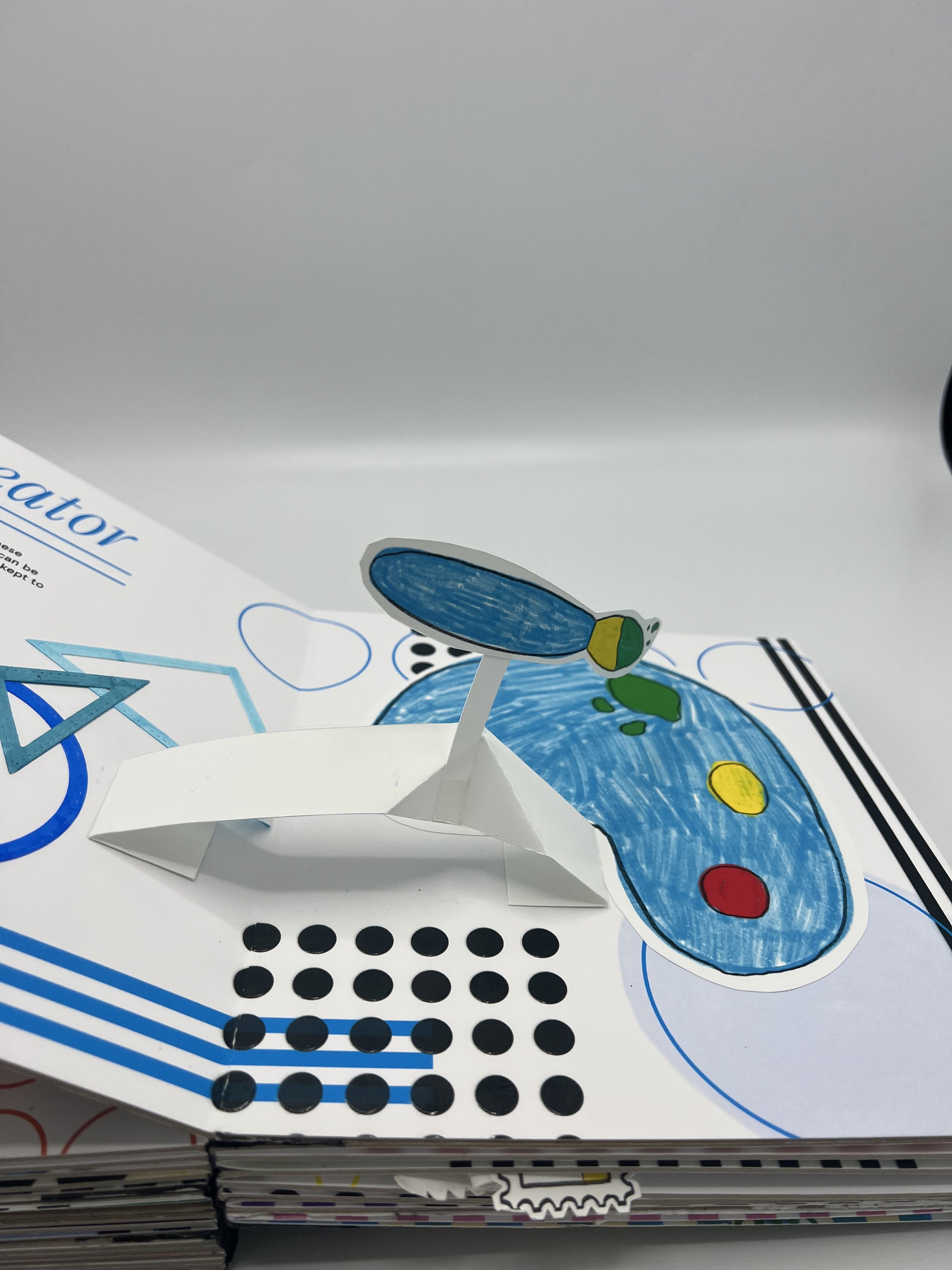
In designing my book, I wanted to showcase my design system and my process. I knew that I wanted the book to have a playful look that reflected my personal design and art style. So, I drew inspiration from my dream journal, where I often color and create using shapes and lines to create “systems” that intertwine.
Initially, I started designing the book but wasn't completely satisfied with the look and feel. Then I came across Memphis design, which immediately resonated with me. Memphis was a movement of Italian architects and designers prominent in the 1980s, who created furniture with bright colors, shapes, and squiggles, which was bold and attention-grabbing. This became a major design inspiration for me.
I used primary colors and a few secondary colors to categorize the play's personalities. I used Victor Narrow for my display text to give it a sophisticated feel that speaks to my target audience, and Apercu for my body text, which felt friendly but still clear.
On my iPad, I created my own handwritten type for each section, adding to the playful and childlike feel of the book. I also created shapes to use for layering and was aiming to have typical graphic elements but also incorporate loose elements that aren't perfect and feel silly or playful.
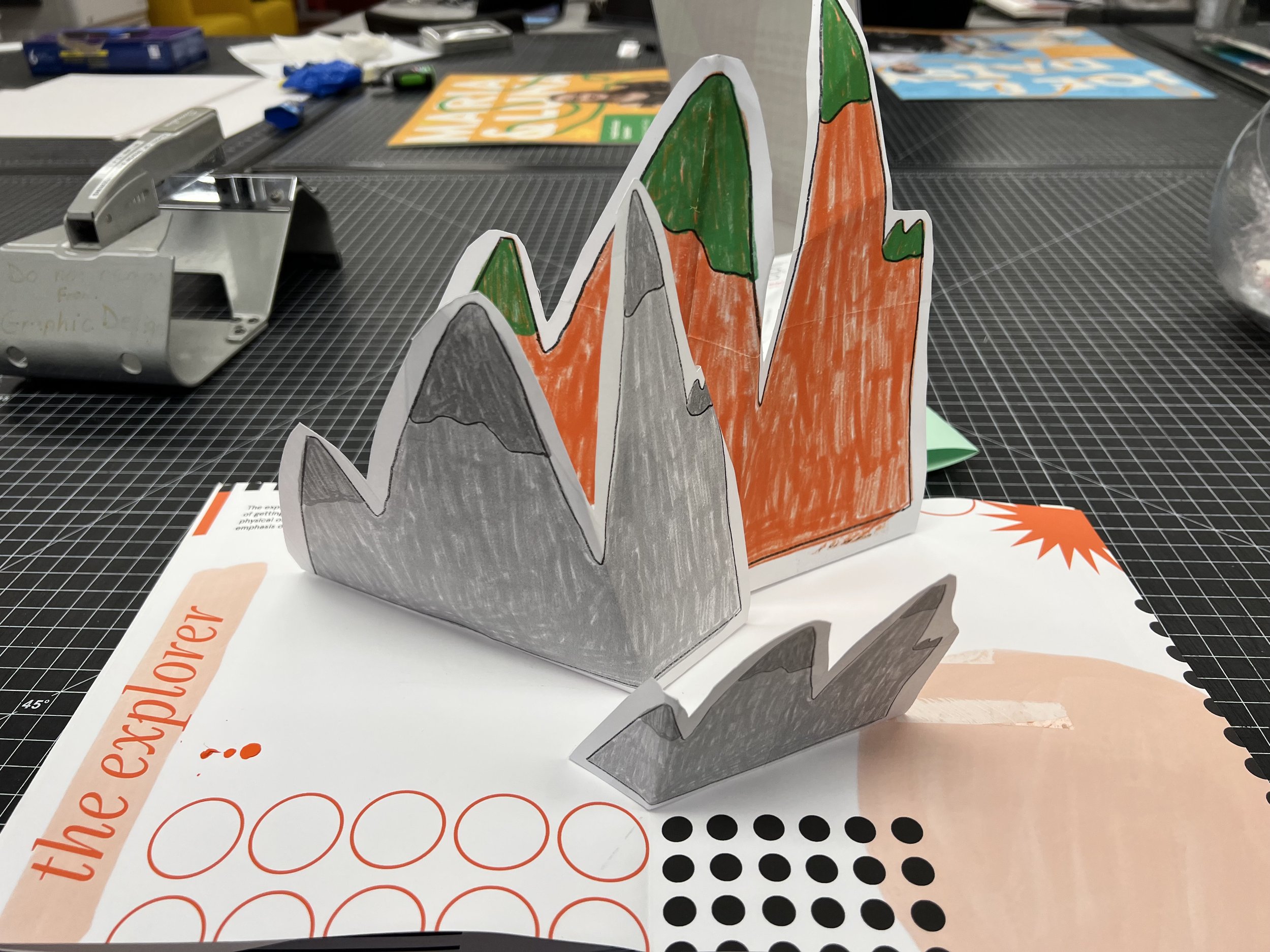
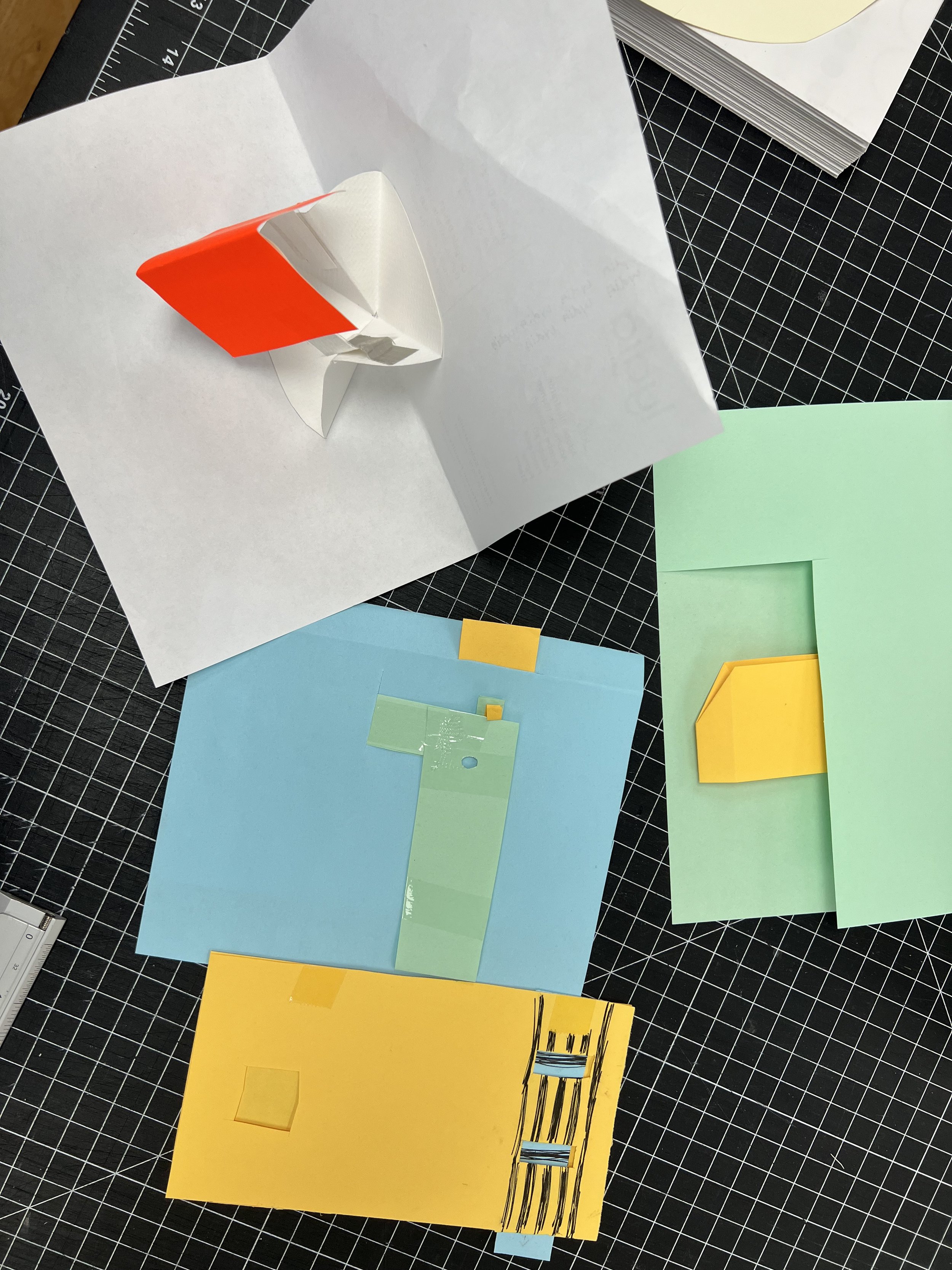
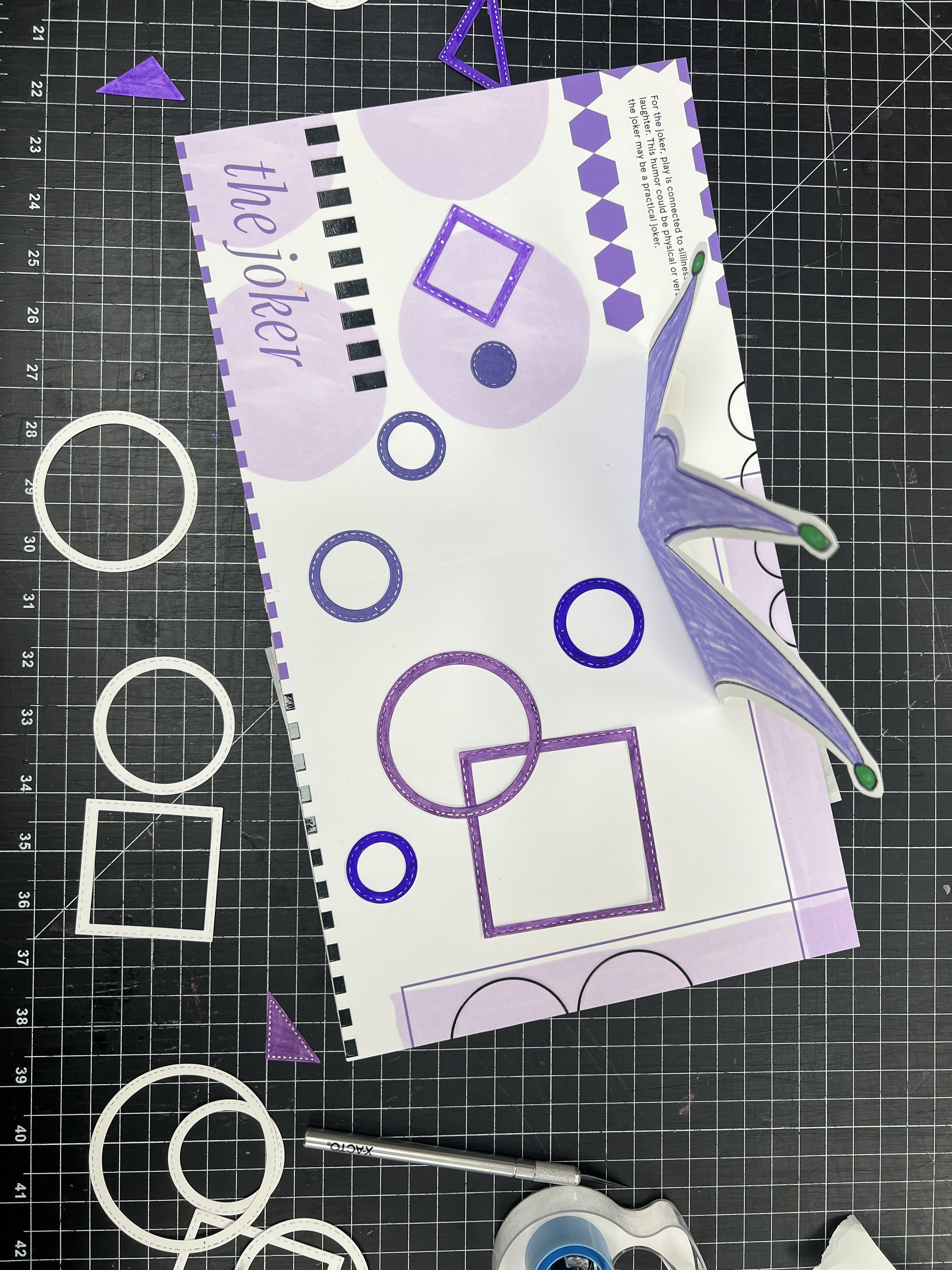
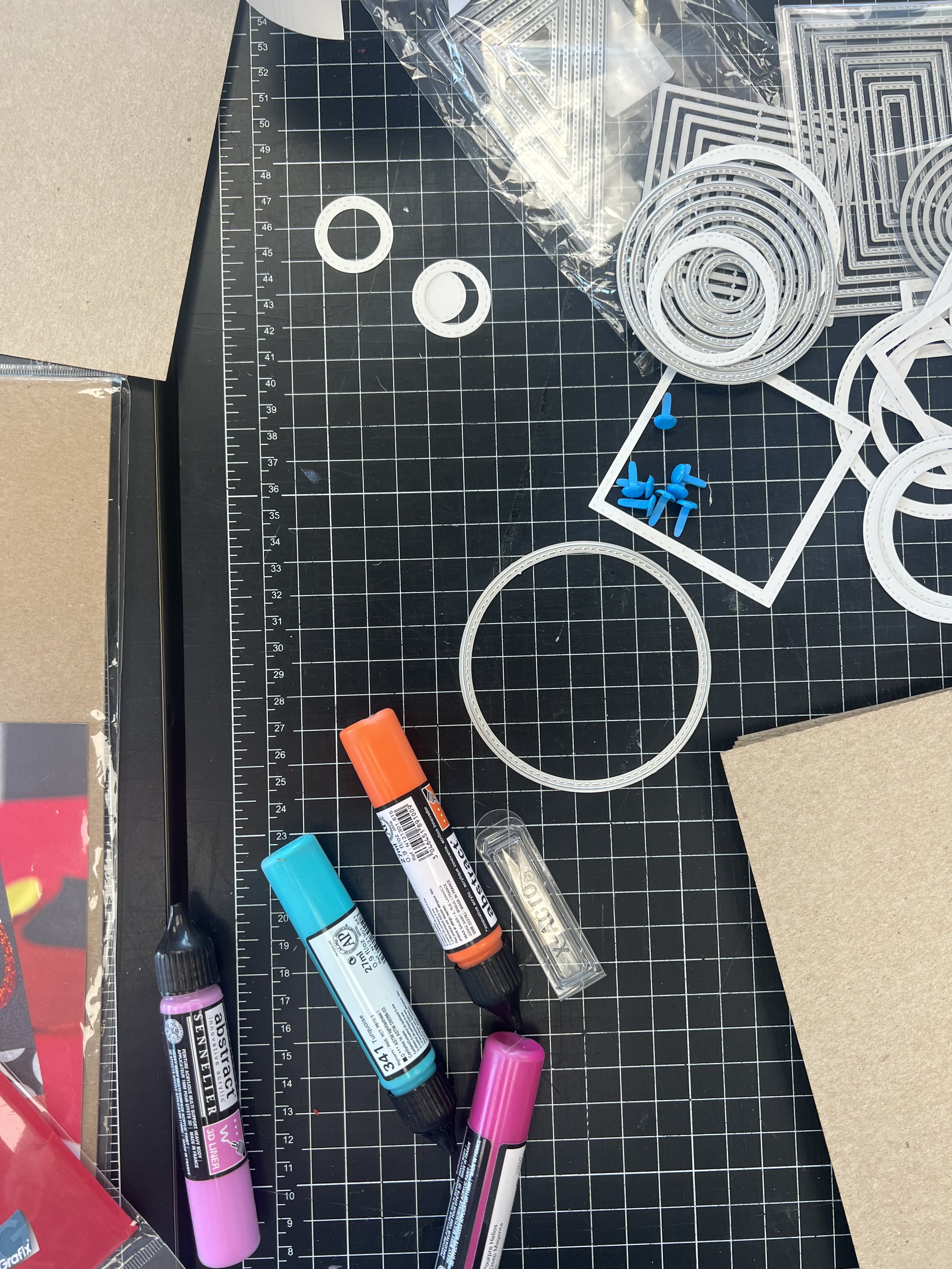
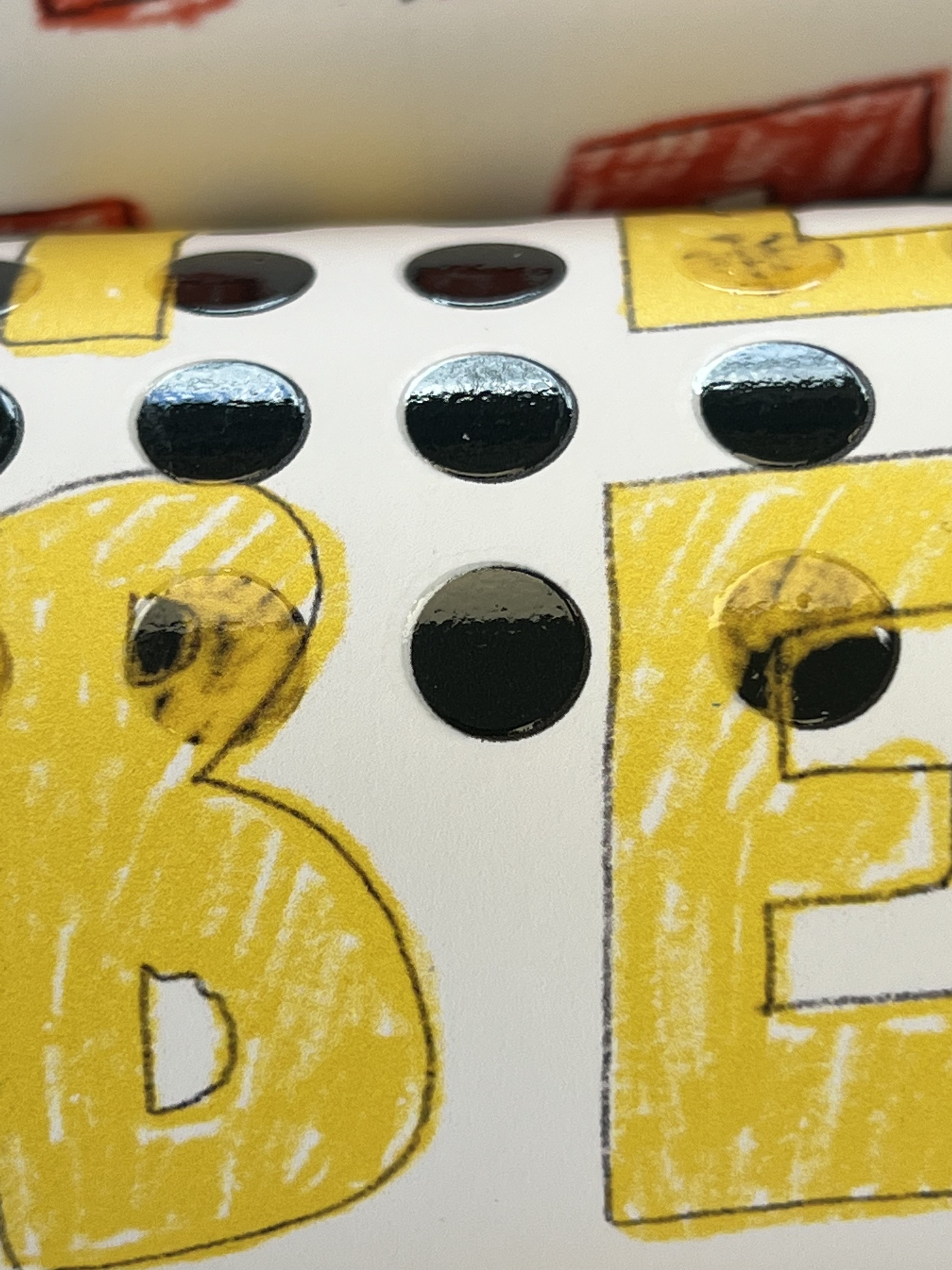
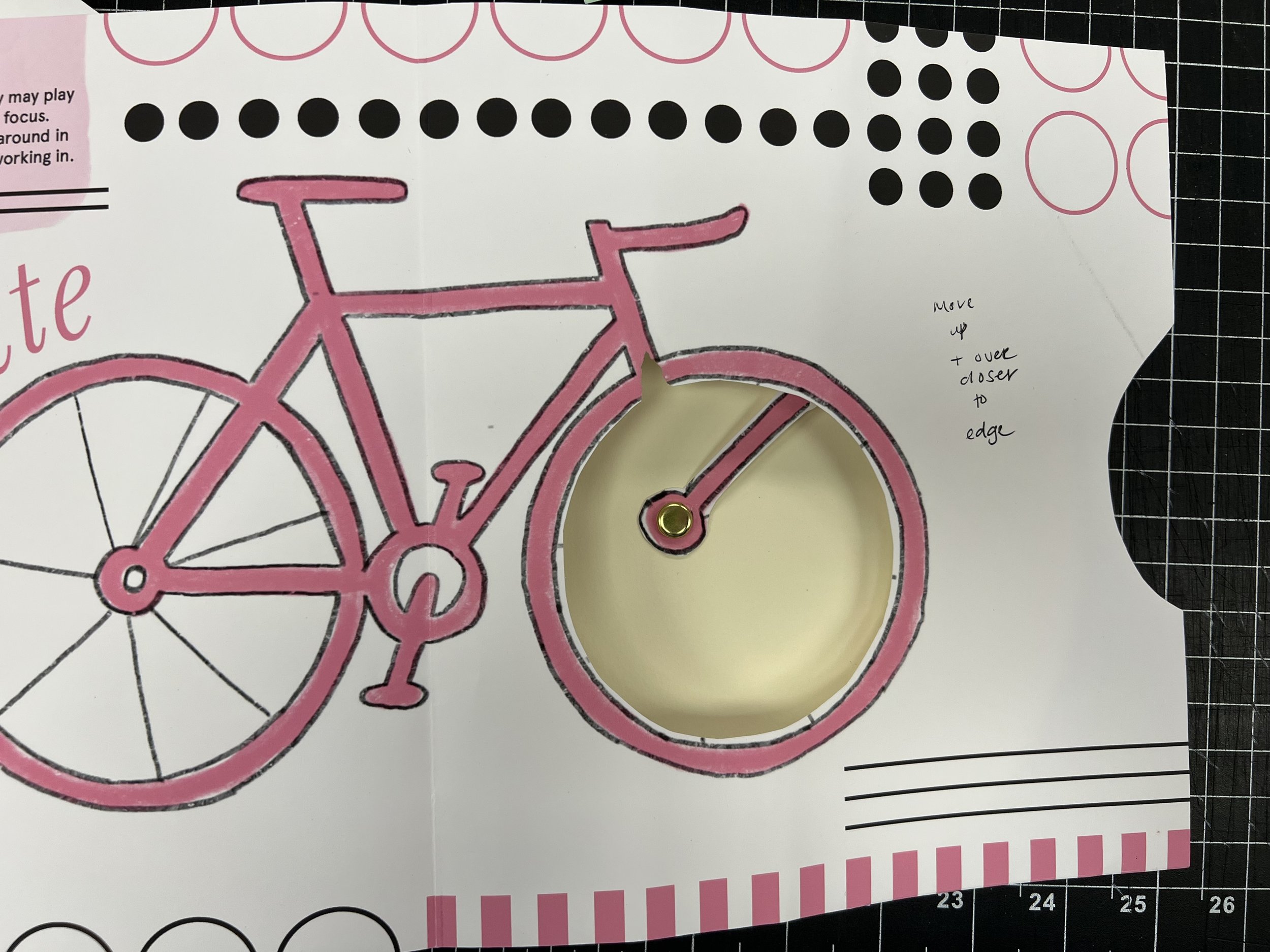
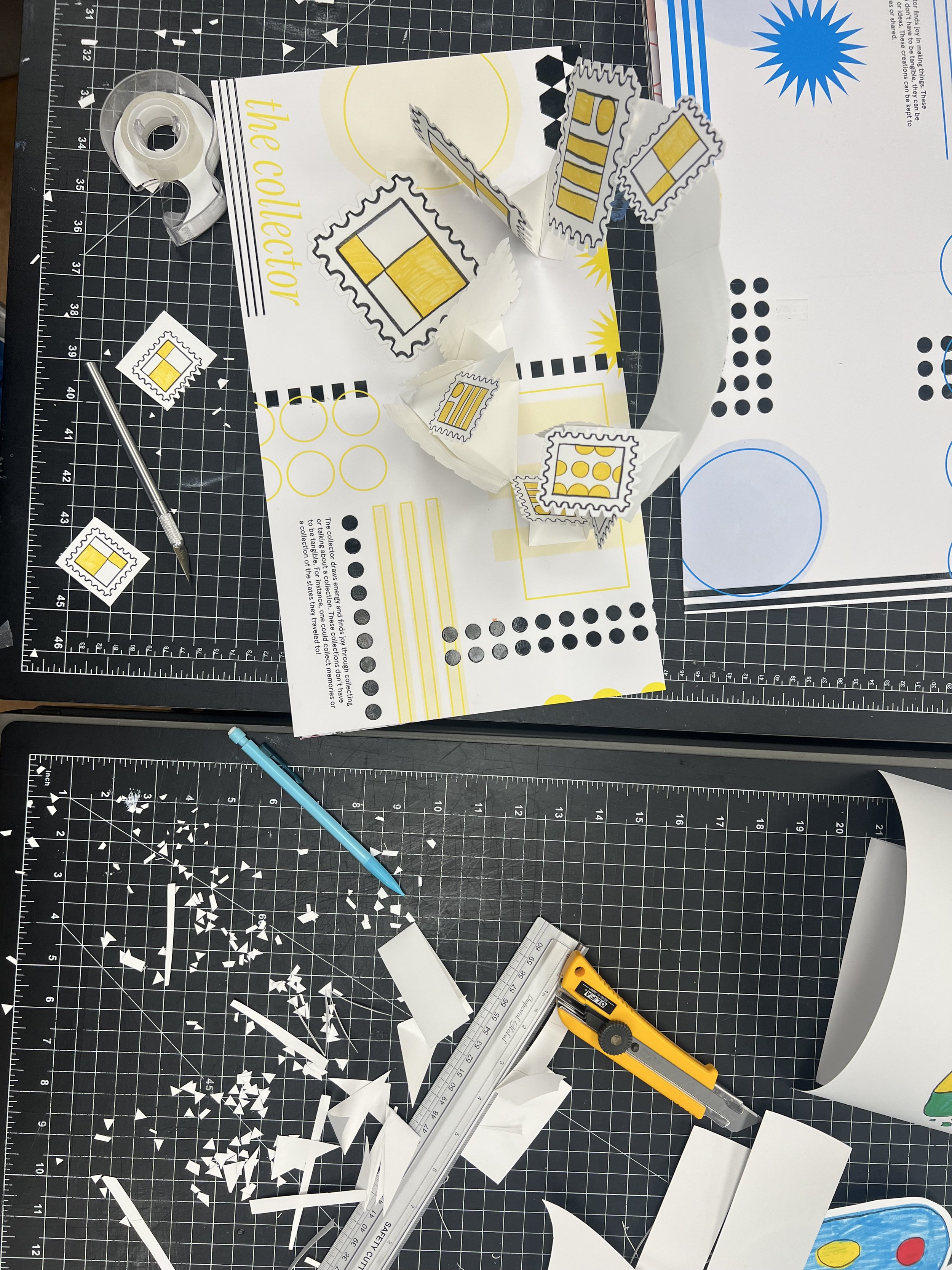
I then embarked on a journey of experimentation and discovery. I spent a lot of time researching paper engineering basics, testing different methods, watching YouTube videos, and dissecting pop-up books to see what was inside.
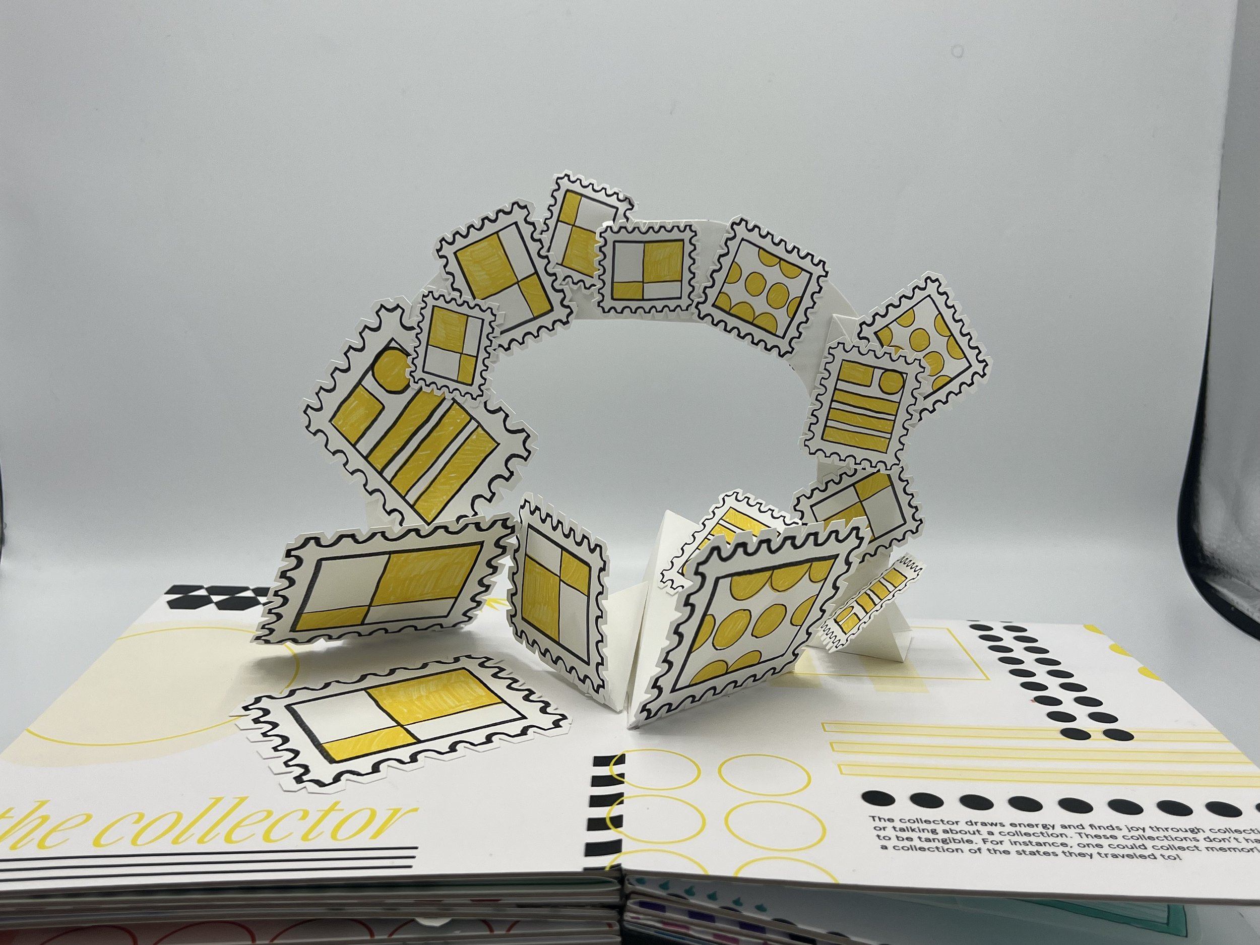
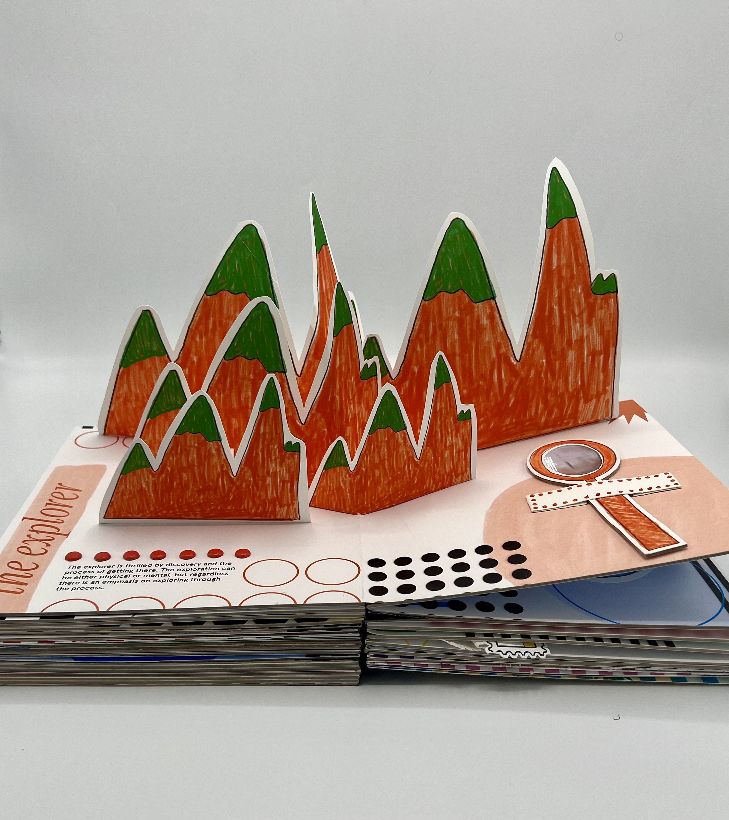
As a tactile person, I enjoyed the challenge of learning different types of folds and figuring out the best materials for paper engineering. I limited the pop-up elements to the play personalities mainly for time's sake but created different assets and images that represented what those play personalities looked like, whether literally or metaphorically.
I used my first prototype to test different pop-up methods and folds, guessing and checking, measuring, and resizing until it functioned. I used paint pens, brass fasteners, and a die-cutting machine to create shapes that I then colored in to add more texture to the pages. I also decided to line each page with chipboard to give it a sturdy structure and mimic the thick build of a typical children's book.
The book grew and grew, and although I never imagined it would be as big as it turned out, I felt that the heftiness of the book spoke to everything I was trying to achieve with the concept of play.
As a designer and a person, I have always resonated with the concept of play. It is crucial to me, and I believe that incorporating play into my work and life is essential for balance and enjoyment. The book I created is a personal expression of myself and what is important to me. In a world where life is short and difficult, I find myself anchoring to play and its concepts to carry me through difficult periods or making the mundane tasks more enjoyable.

